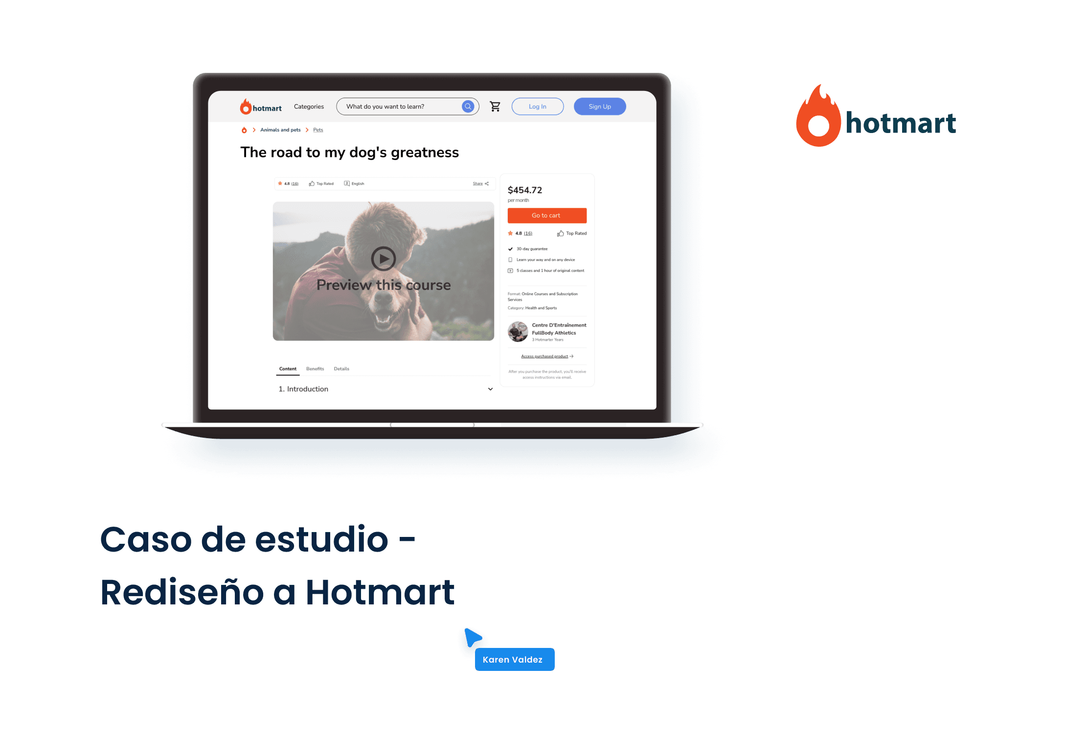
Description
Hotmart is a powerful e-learning platform that works as a marketplace, a space dedicated to the purchase and sale of digital products. From courses and e-books to podcasts and subscriptions, the variety is extensive and covers numerous categories.
Roles:
UX Research
UX Design
UI Design
Tools:
FigJam
Figma
Google Forms
Optimal Workshop
Balsamiq
Problem
Hotmart has +35 million users (content creators, affiliates, and buyers), and +580 thousand products (courses, e-books, podcasts, events, and much more); currently, the platform is deficient in how its content is structured, and there are totally necessary gaps within its marketplace, where there is no balance point in what it offers and how it is being offered within its process. Purchasing, from product search, information consultation, purchase, and viewing. The platform must carry out a thorough review of its structure and content to compete effectively in the current market. This way, you can maximize your potential and attract more users interested in your services.
Objectives and goals
Improve the quality and appearance of the platform
Users can buy quickly and easily
It is natural for users to locate a product depending on the type of content it is.
Users are completely certain that the content is what they are looking for, thanks to the details shown, and that the same satisfaction is maintained from the first instance at the time of purchase.
Quantitative investigation
A survey, with 15 closed questions and 2 open questions, was conducted with people between 25–35 years old and they participated voluntarily.
Observations
50% Use a platform to expand your knowledge
83% I would not buy a course that does not have an introductory video of this
67% Prefer to log in from the suggested options
90% Use a computer to take online courses
Competitor analysis
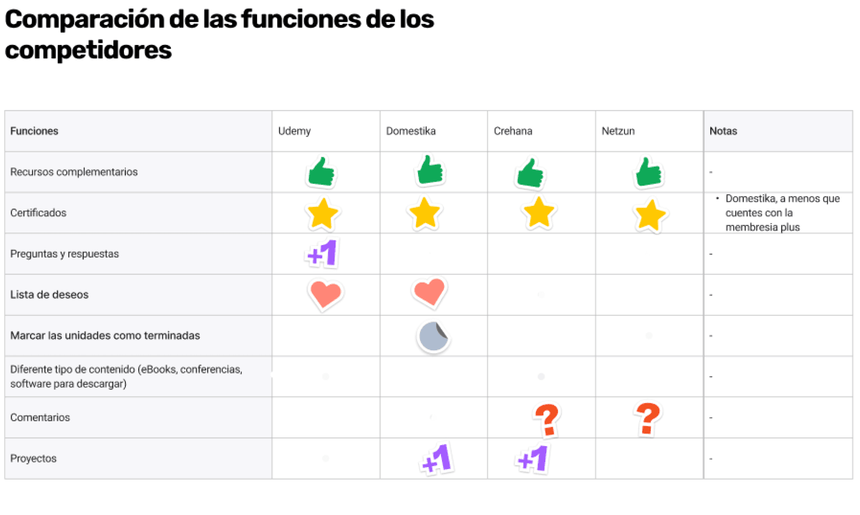
Findings in the Benchmark
The appearance of aesthetics.
Most competitors only offer course-type content.
Questions and answers, and Wish List, are functionalities that most don't have implemented.
On the UI, the course cards show the price, and the cart inside the purchase button, this is also visible in the header.
To log in, most show different social login options.
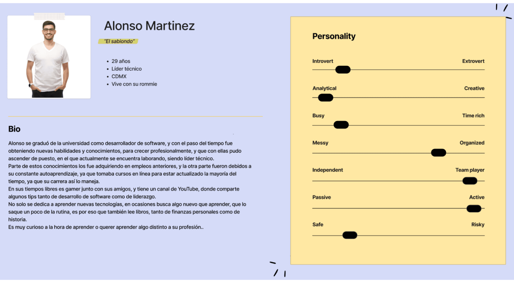
User persona
Alonso Martínez is a professional in the IT area, and among his motivations is acquiring new knowledge and being able to share his teachings. Therefore, one of his important needs is to find a platform of courses that are varied and innovative to fulfill his objective of learning a new skill, this comes from a frustration that makes him feel that he lacks technical skills.
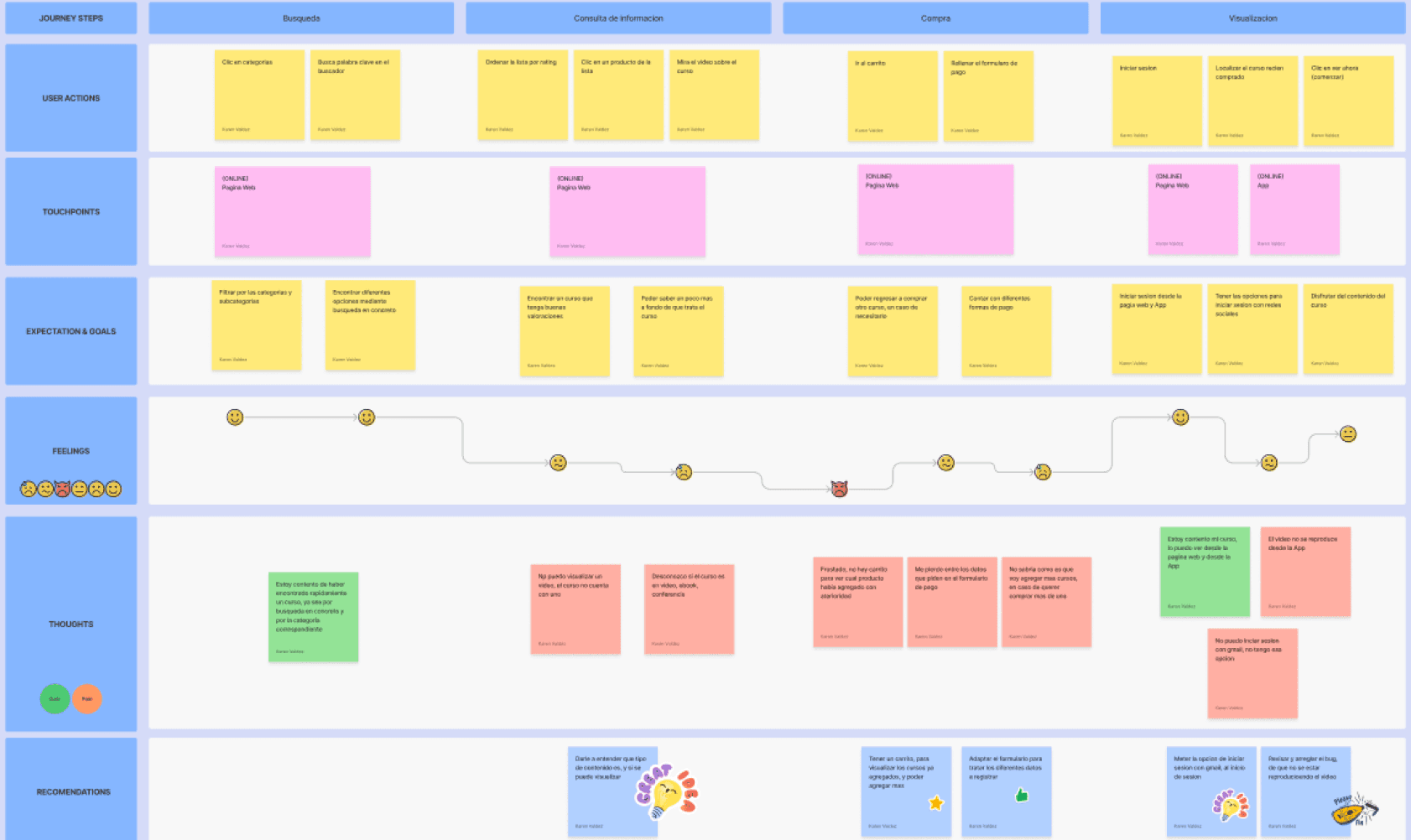
Customer Journey Map
Knowing a little about Alonso's history, the following scenario was posed: “Alonso wants to buy a course that will help him have content that he can address on his channel.” And this is how he further broke down the emotions that were evoked in each of the steps for said scenario.
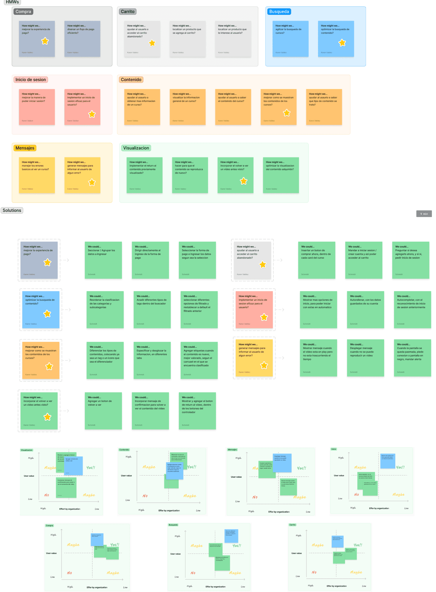
How might we…
“Every problem is an opportunity for design”, and following this ideology is how several ideas are generated for the different sections where we can devise and propose an improvement, and in the end take the most viable option to obtain a solution, placing all of them in the traceability matrix, validating the effort that would be required to resolve it, and the added value that it would generate for the user.
Information Architecture
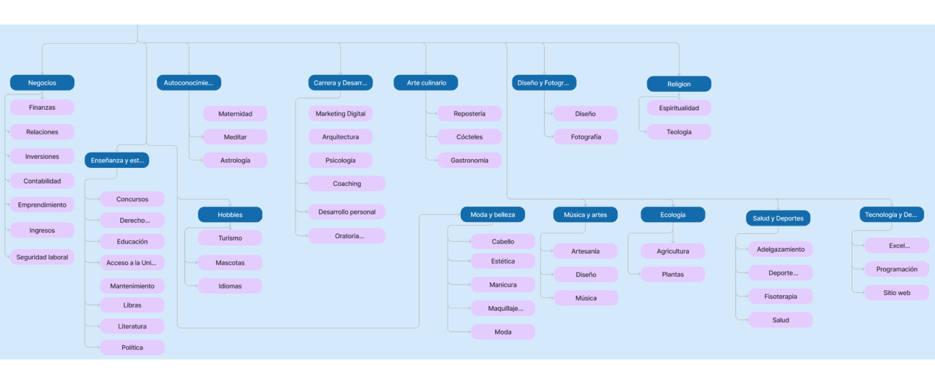
The art of organizing information as clearly and logically as possible. In this way, the user will be able to easily find what he is looking for. And currently, the categories section has a great variety, which is why it was decided to apply a card sorting study, to find out if this organization works for the user.
After the study and based on the responses obtained, it was possible to regroup some subcategories within other categories, and even create new categories with existing subcategories, making them more understandable for the user.
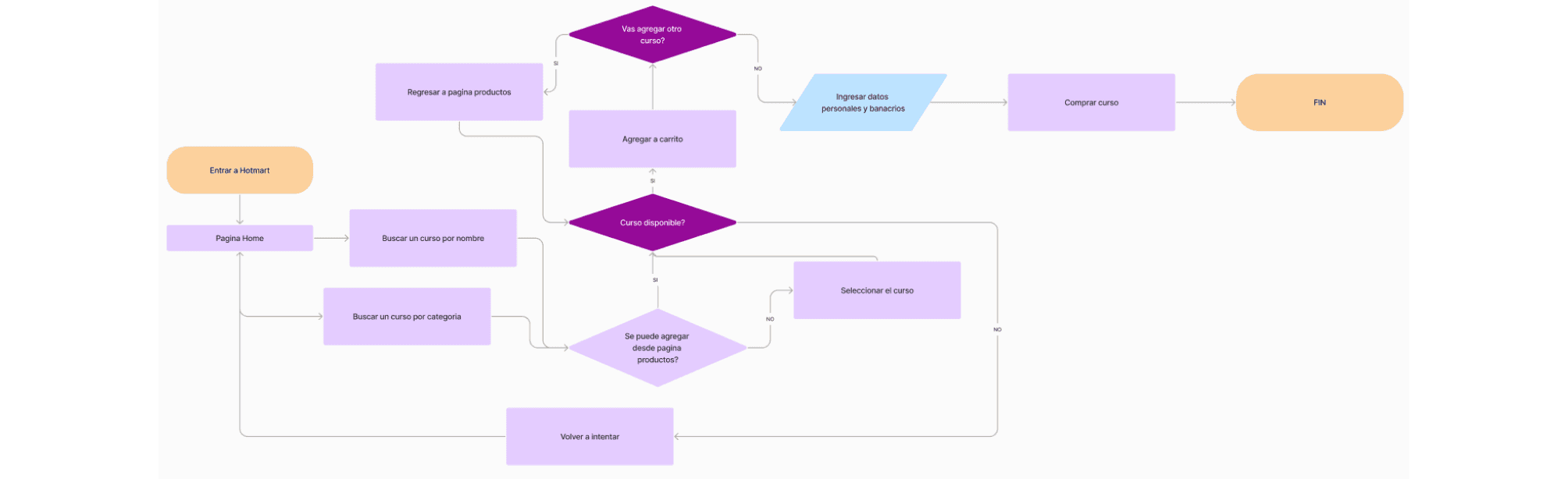
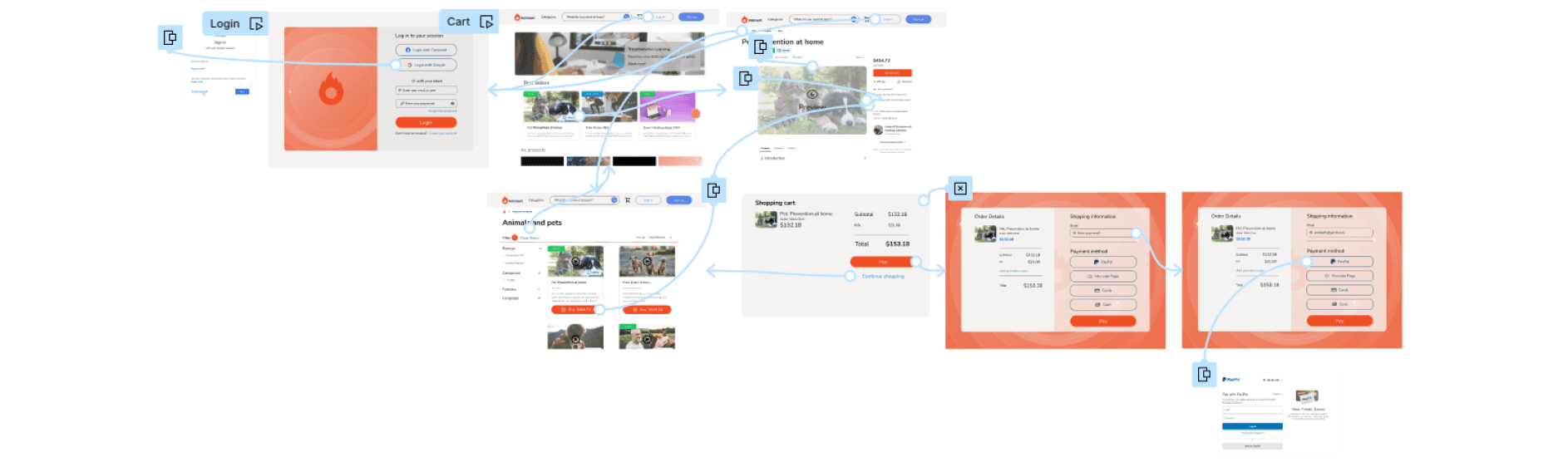
User Flow
The user journey is represented with a flowchart to graphically show the steps they must take to complete an experience in a digital environment. This user flow was part of the inventory that the platform currently has in its cart - product purchase process.
And by not having a main cart option, users had no way to return and could make more than one purchase. With this redesign in the flow: the shopping cart, an indispensable and essential part of the main flow, is solved.
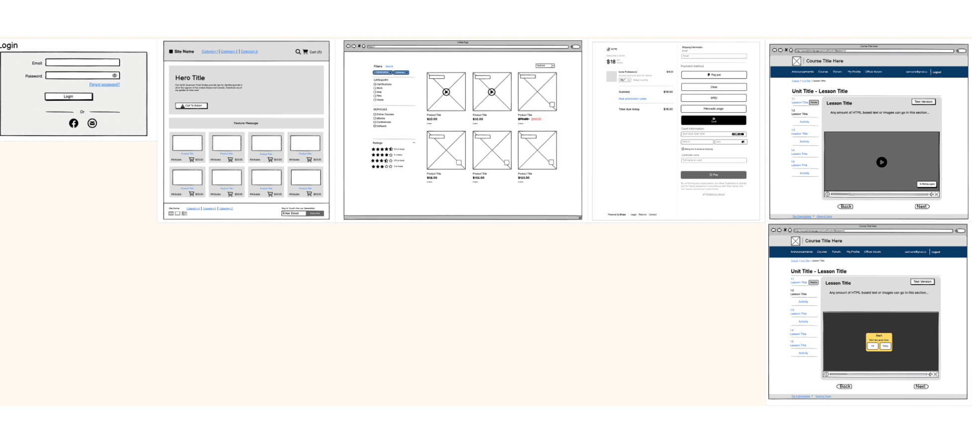
Wireframes - Medium fidelity
Schematic representation of each of the most significant screens that reflects the functionalities that will be present once implemented. Thus showing the design of the desktop interface, oriented towards the solutions highlighted in the ideation section.
Interface design
Login
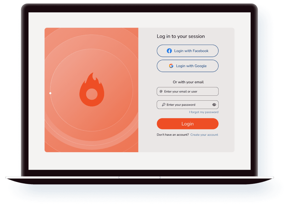
The option to enter through a Gmail (Google) account was added to the login screen. And he adapted to a more common accommodation.
Categories
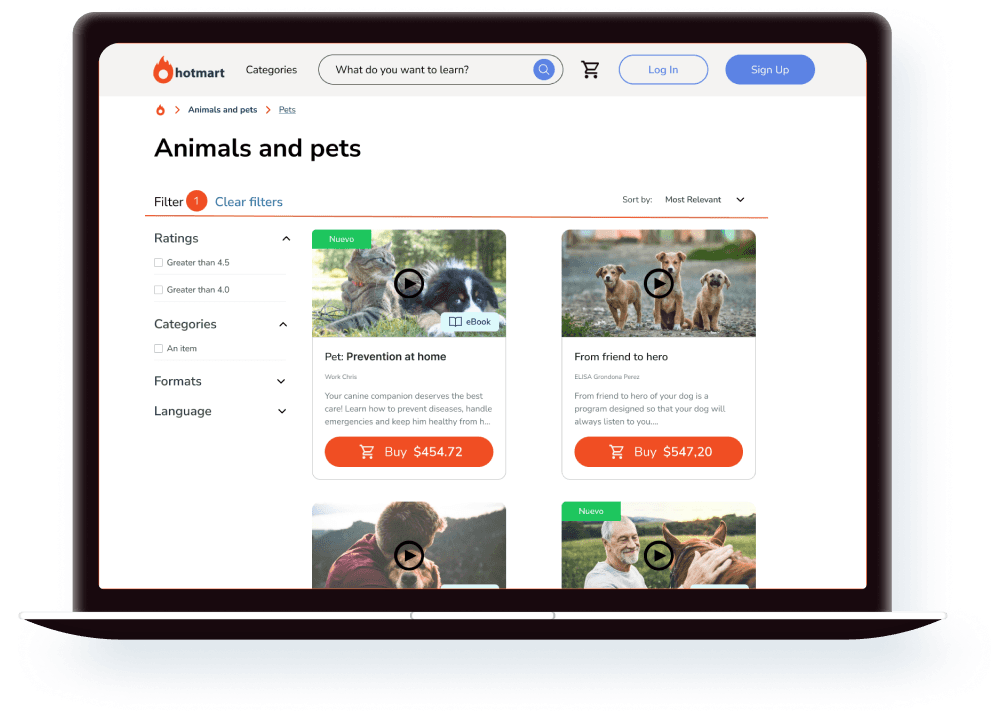
From this screen you can now add to the cart, the button is found on each of the cards. You can also watch the introductory video without having to go to a specific course. Added a button to clear applied filters, and labels to recognize the type of content, and adjusted the guide to where you are currently.
Subcategory
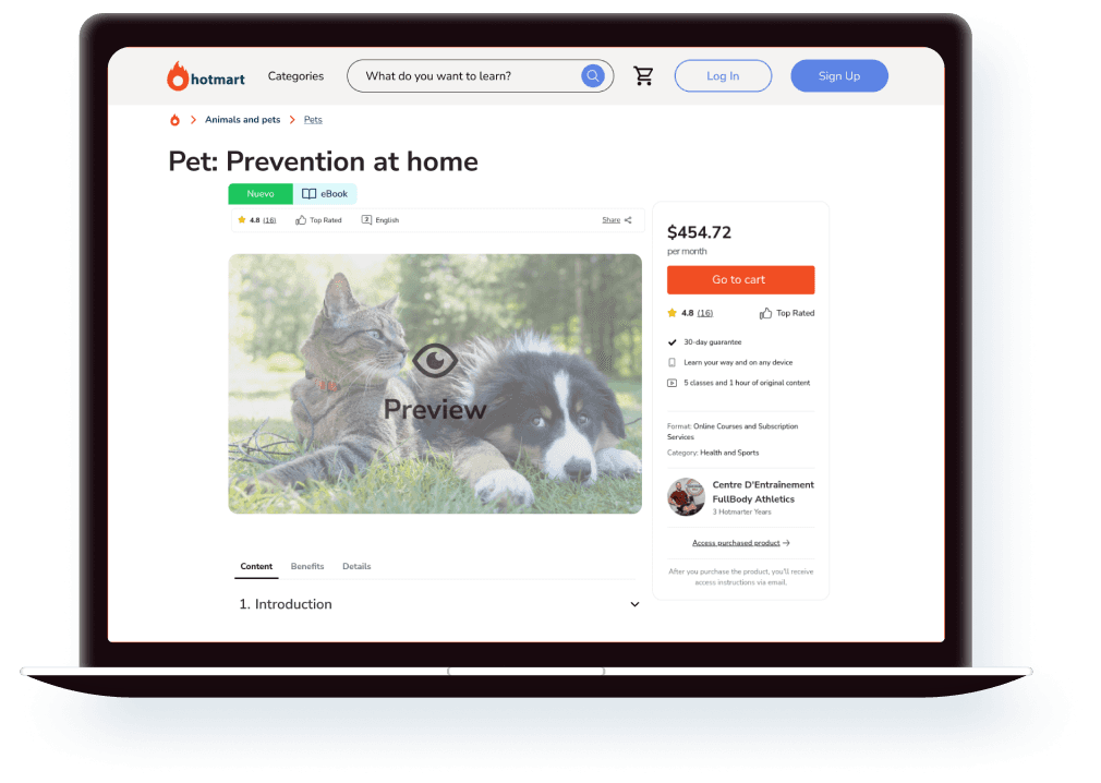
Once you are in a selected and classified course, you can identify what type of content it is and its classification. A preview of the content was added, for the video and e-book format.
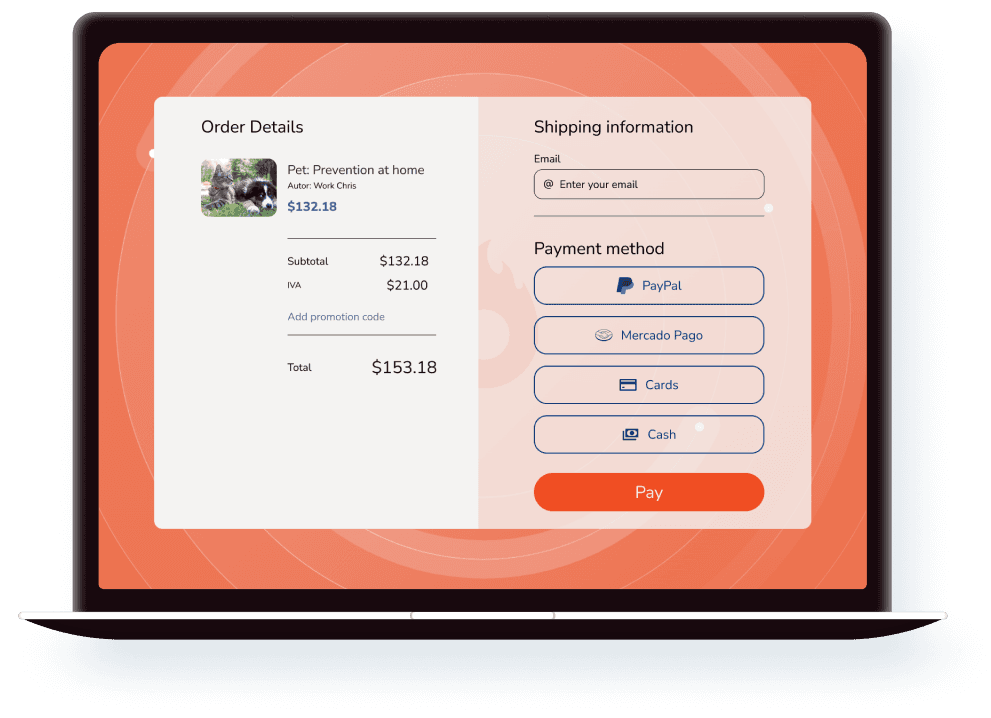
Purchase order
This view was completely redesigned, grouping and separating the sections, making them more visible and orderly. Sending the purchase details to the left, and the person data and purchase methods to the right.
Usability testing
Carrying out the usability test on some users, very good feedback was received, which served to see where the redesign of each of the screens is, and the result was favorable, since the users were able to complete all the proposed tasks, and They found it easy to execute them, completing them in a relatively short time, and without any difficulty; For them the flow is logical. Likewise, the improvements proposed and mentioned by the participants are of great help in understanding the possible adjustments that must be implemented.
Conclusion
The project of redesigning the Hotmart marketplace was a great challenge for me since there were points of improvement from the UI to somewhat critical points, such as not having a shopping cart in its header, since most of the marketplaces are of that nature, they should have one and always given the user, which even the comparison between the competitors made it very clear. And there were even factors that stood out at first glance and that continue to require a total, general redesign.
We must always take into account that a structured and easy-to-understand design will improve your experience, facilitating navigation, including interaction, to ensure that users find what they are looking for in a relatively short time.
The reorganization of clear and simple categories will help simplify the search and selection of products, and thus guarantee more efficient purchases for both the user and the customer. All this shows the most relevant aspects and the findings found and summarized broadly. In the end, it made me feel satisfied with the result obtained since it was essential to create and discover how to help a user who purchases digital products.